Today
I want to show you a
Memory Box
that I painted for our chapter
Cape Cod Mayflower Decorative Painters
This box will be donated to a local
HOSPICE
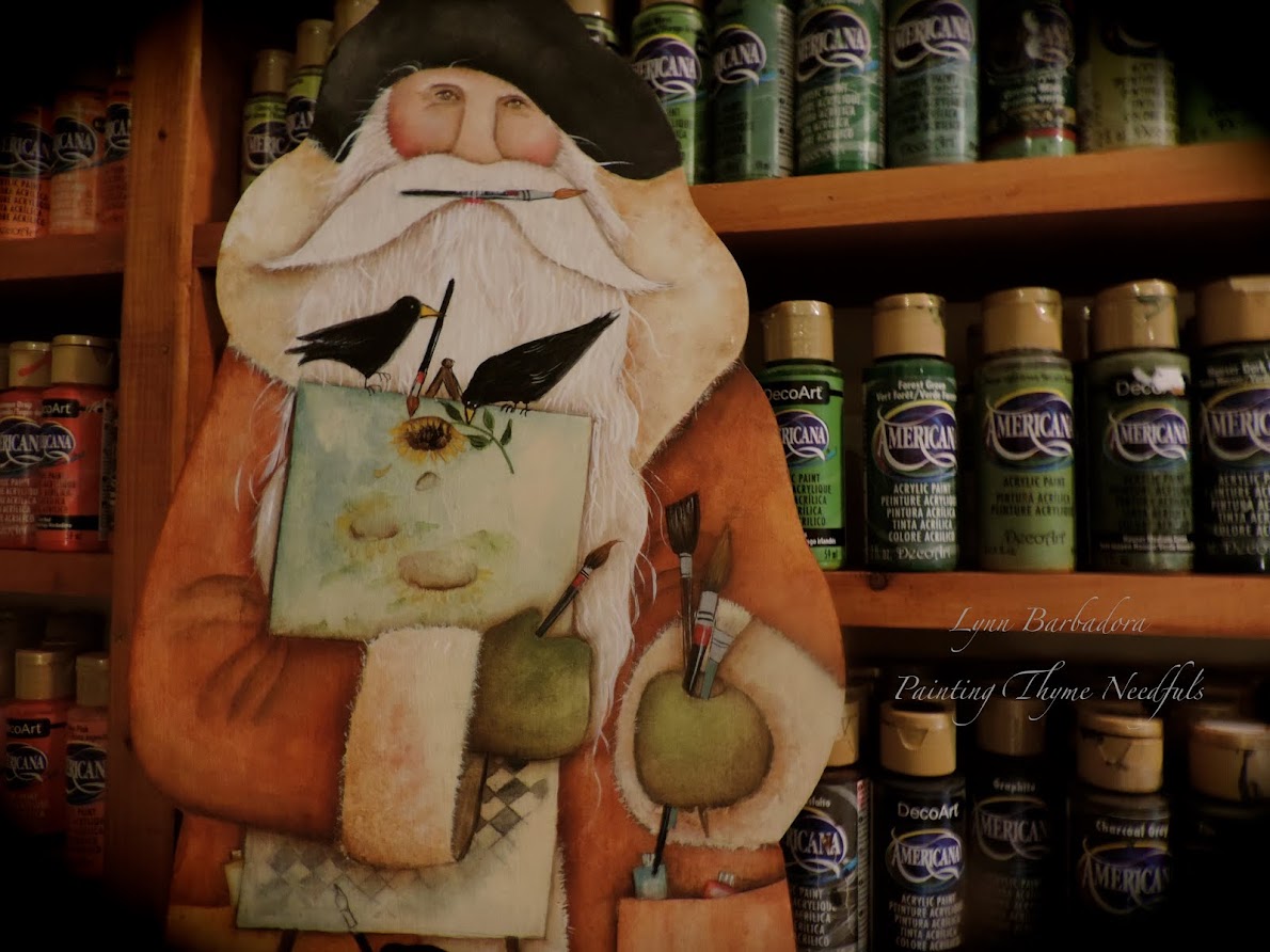
Step inside my STUDIO and lets get started!

I used a design
by
Rebecca Trimble
for this project.
The original design
called
Tranquil Times Portside Clock
appeared in the
August 2010 Issue
of
Quick and Easy painting
I adapted the clock design to fit my surface.
MY PALETTE

Antique Green, Antique White, Asphaltum, Avocado, Light Avocado, Black Green, Black Plum, Blue Chiffon, Burnt Sienna, Cadmium Yellow, Camel, Cocoa, Driftwood, French Vanilla, Gingerbread, Hauser Medium Green, Light Buttermilk, Neutral Grey, Plantation Pine, Raw Sienna, Rookwood Red, Snow ( Titanium) White, Soft Black, Soft Sage, Williamsburg Blue
Let's Paint
I began by base coating the top of the box with a mix
plus
Light Buttermilk (1:1)


I let the first coat dry completely then I based with a coat
of
Light Buttermilk

I use a foam applicator brush to apply the second coat.
Once I dip it in the paint I use a "press and lift" method to apply the paint.
This gives your surface a slight texture.
**** To do this use the FLAT side of the foam brush (not the chisel edge).
Repeatedly press the loaded brush down onto your surface , and then lift brush straight up without bending it. Continue to cover your surface in this manner. When complete you can go back over your surface with the same brush ( do no wash it) to refine the texture some.
This technique makes painting small detail easier.

I first painted in the sky
then
based coated in the water

I use
for base coating in small areas.
I have these in several sizes

I use Lowell Cornell Ultra Rounds quite often to shade with.
I "mop" with Maxine Mops
Brushes always come down to personal preference
BUT
it is really important to buy the
BEST quality brushes you can afford!
Good brushes really do make a difference in your painting!

Here I have added some shading details to the hills in the distance.
I have painted the ship in the background.
I base coated the cliffs in the foreground with Cocoa.
I used a large #14 Lowell Cornell Ultra round brush for the shading on the cliffs.
This brush holds a LOT of water
and
can create some nice affects when shading along with your mop brush.
I do most of my highlighting
using a
I have these in several sizes and love the soft affect you can achieve with them!

After I base coated the tree trunks I added the foliage
with a
SPONGE.

I cut my sponge into
small wedges.
It adds a nice "airy" look.

I have started base coating the houses in the distance.

I have now started adding the details and shading to the small houses

I have painted the lighthouse

I randomly added the bricks to the lighthouse.

After base coating the house on the right I began to work on the stones

I have now begun to work on the foreground shrubs


I have now begun working on the foreground ship

I painted the bottom of the box Light Avocado

Ready for varnish!

to
finish my box

I apply the first coat of varnish with a brush.
I let that dry well before applying several more coats of varnish with a sponge.
Let each coat dry completely!


I applied 4 coats of varnish to the cover of the box

Completed Memory Box
DecoArt
provided me with the paints to complete this project
as part of their
Helping Artist

and
Blogger Outreach Program


Thank you DecoArt for all the wonderful products to create with!

I hope that you have enjoyed watching me paint this Memory Box.
Happy Painting!
Lynn


